Claire Watanabe
← Select projects
Tinder · July 2026

The Tinder Rebrand

Tinder's first rebrand in nearly a decade: a redrawn flame, an all-caps wordmark, a serif for headlines and a wider palette.

Made with
Porto Rocha ↗
The New York studio we worked with on the new identity.
App Store screen reading It starts with a swipe over a photo of a couple, with the new Tinder wordmark
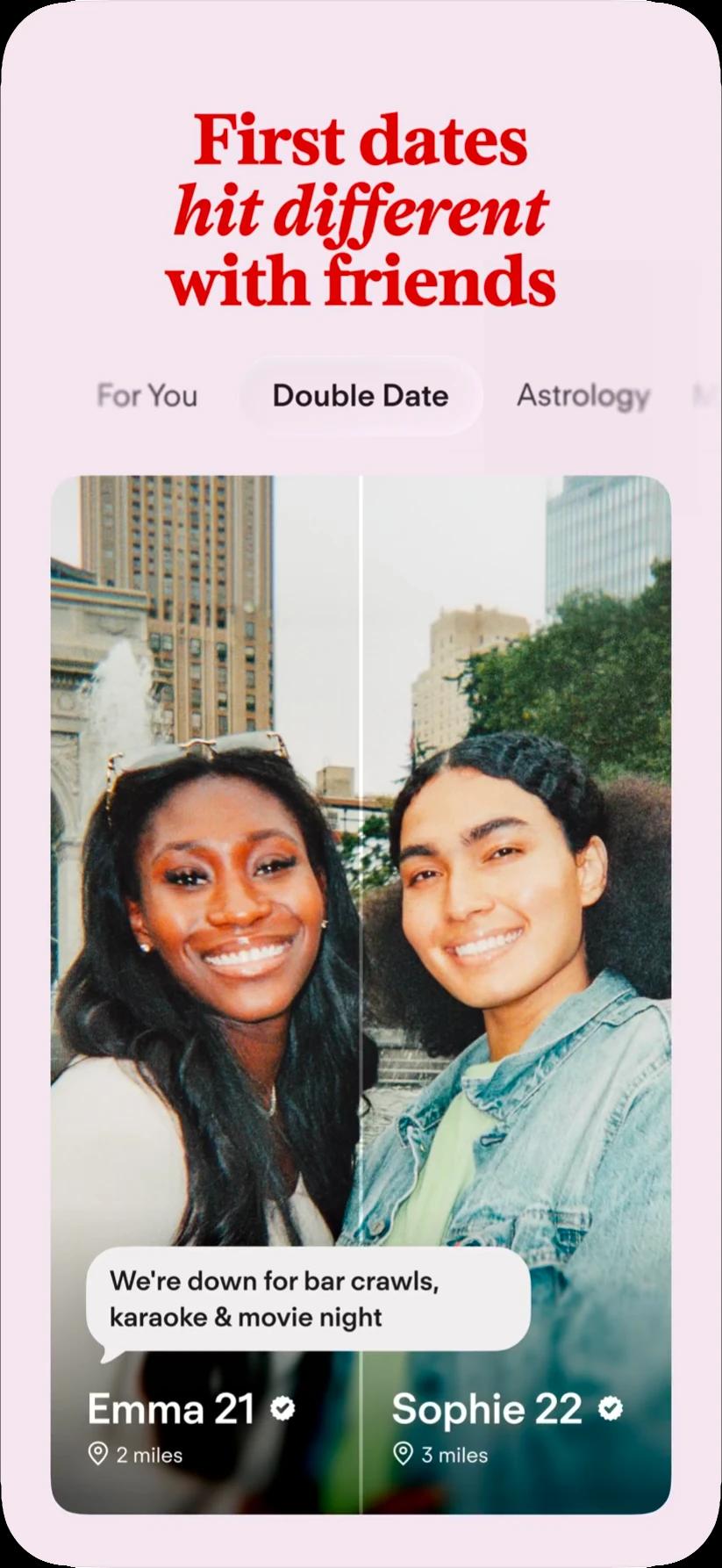
App Store screen reading First dates hit different with friends, showing a Double Date profile
App Store screen reading Connect with confidence, showing a photo-verified profile
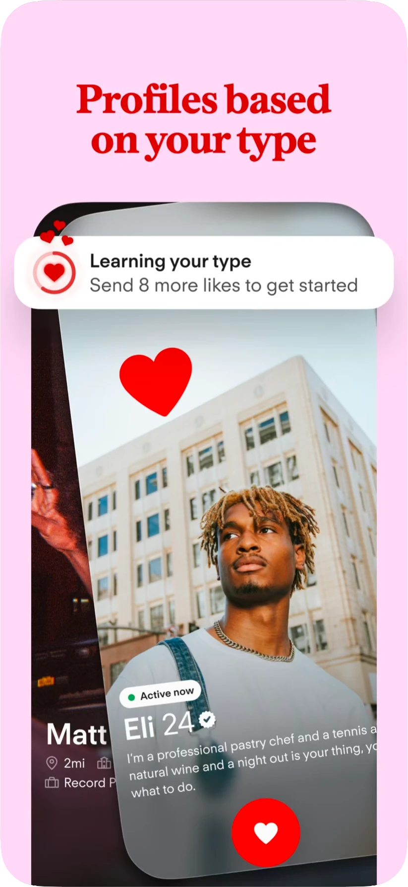
App Store screen reading Profiles based on your type, showing a profile card with a heart

The new look inside the app, from the current App Store listing. Images: Tinder.
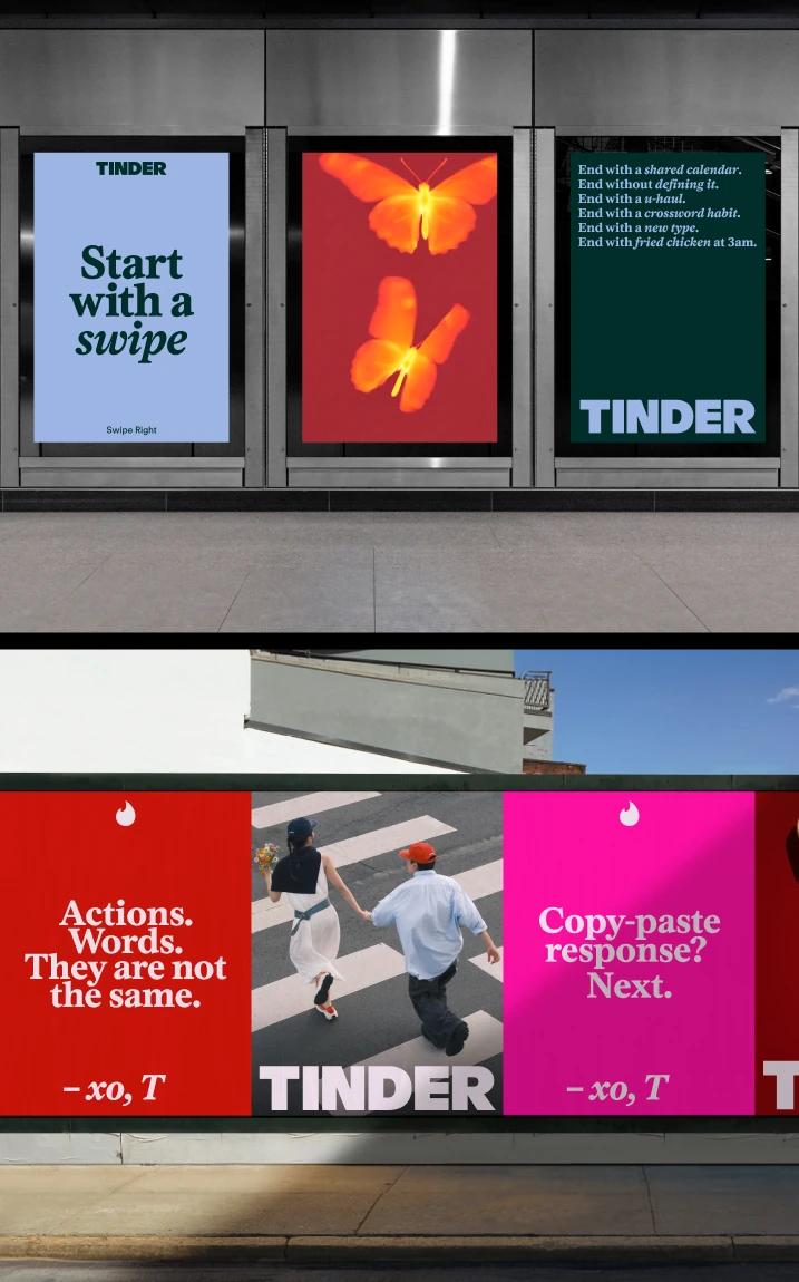
Tinder posters in a subway station and on a street billboard, with lines such as Start with a swipe
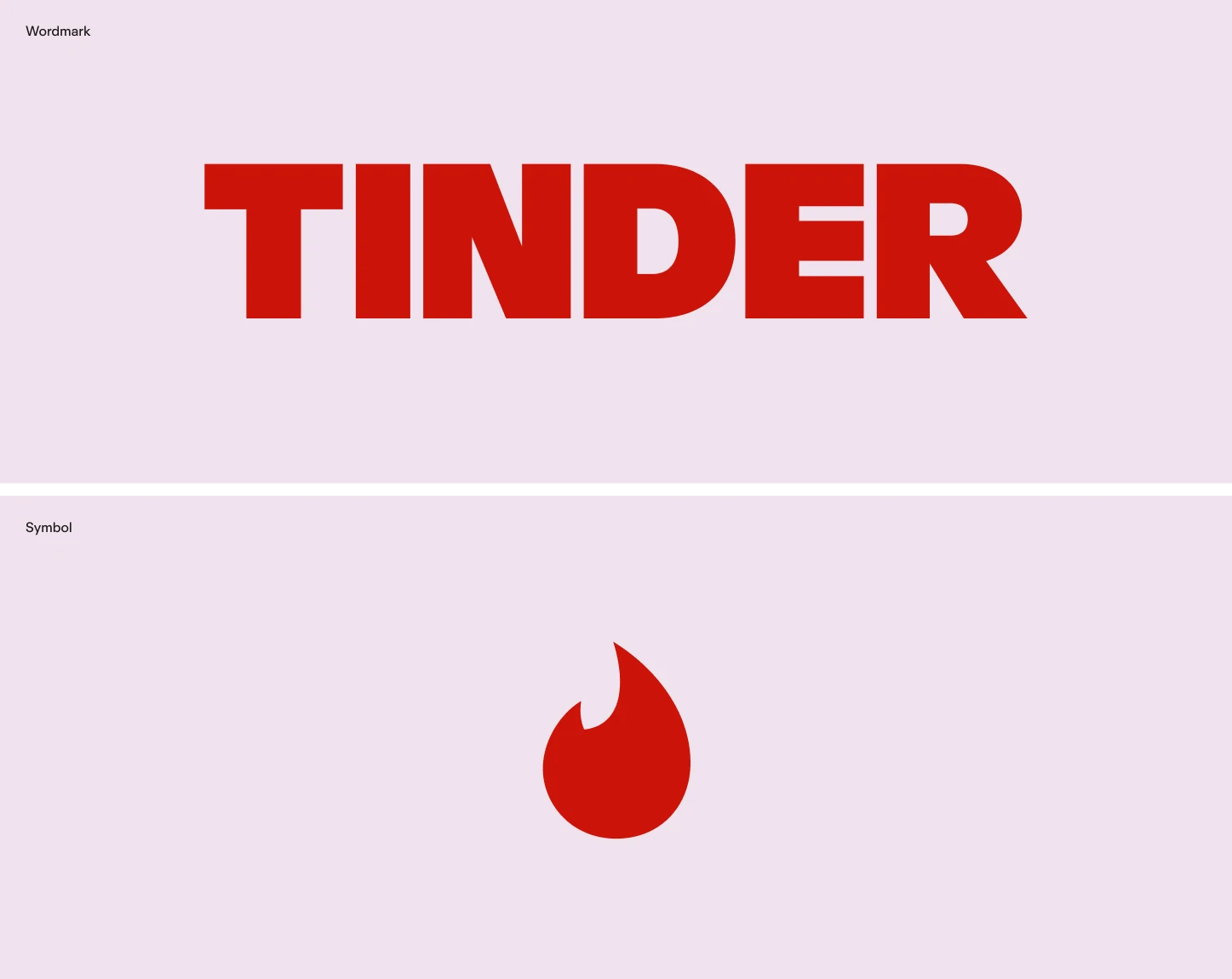
The new all-caps Tinder wordmark in red above the redrawn flame symbol, on pale pink
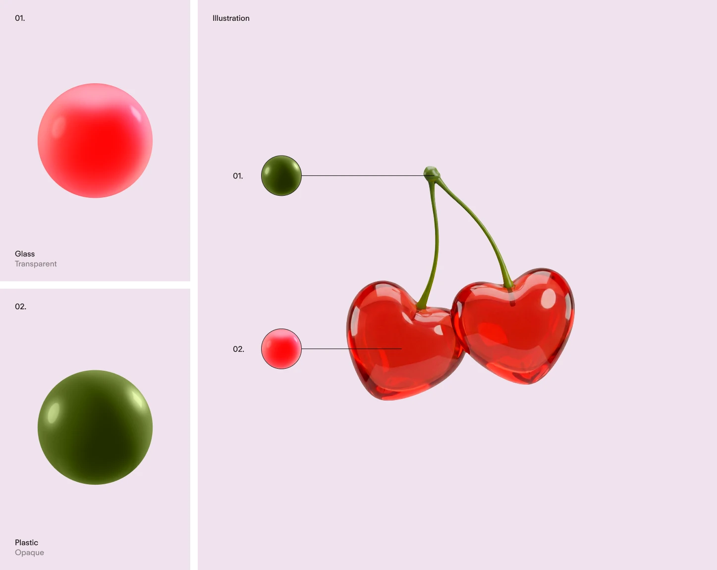
The 3D illustration style: a glossy red sphere, an olive sphere and a pair of cherries
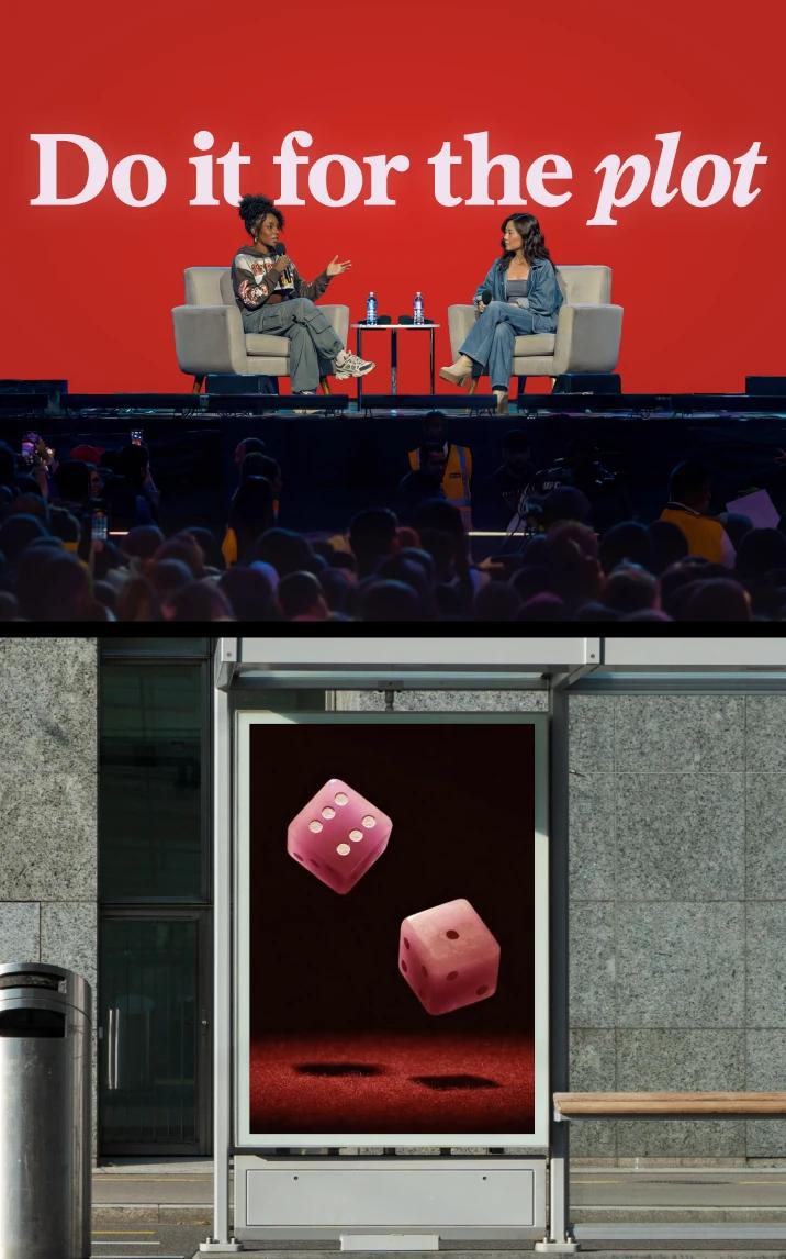
A conference stage under the line Do it for the plot, above a street poster showing two red dice

The wordmark, the flame and the illustration style, with the identity on posters and on stage.
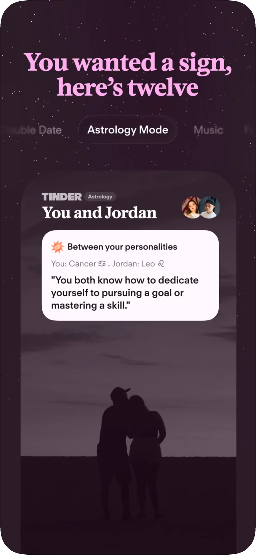
App Store screen reading You wanted a sign, here is twelve, showing Astrology Mode
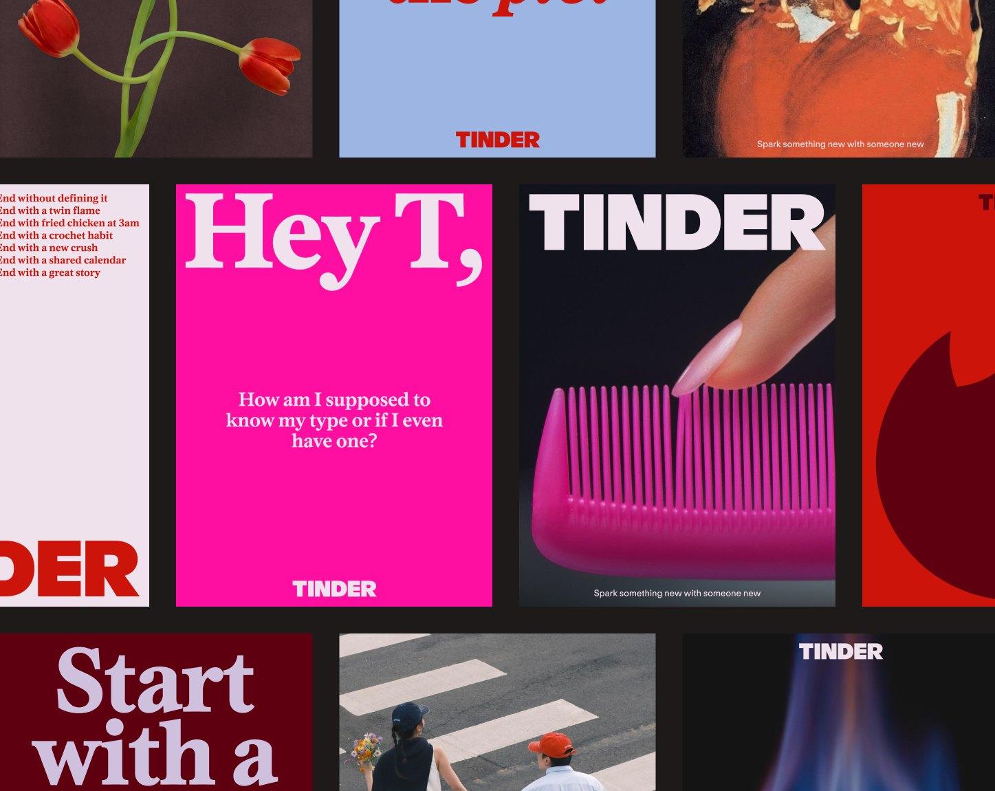
A collage of Tinder adverts in pink, red and blue with serif headlines such as Hey T, and the wordmark

Adverts in the new identity, beside Astrology Mode in the app. Images: Tinder.